Showing posts with label Bootstrap. Show all posts

Thursday, August 8, 2013

Creating Tooltips in Bootstrap - Two Different Styles

In this post, I am going to go over the two different ways to make tooltips in Xpages using Twitter Bootstrap.

Background

I was wanting to create tooltips to shorten my labels and streamline a crowded window with many input fields in the application I am building.   After a quick search, I found an article that Kathy Brown wrote on how to create tooltips.   Within a few minutes I had a working tooltip, but I wanted tooltips that looked like what I saw on the Bootstrap site.
I wanted my tooltips to look like this
I tried a changing attributes using and couldn't do anything to change the default behavior.  I did remember to add 'data-' before the attributes.   After some searching and the help of jsfiddle, I was able to figure how the easiest way to create tooltips how I wanted them.

Option 1

This way is extremely simple and quick to implement.   In my case, I wanted to the tooltips to be on the labels.  You will notice that I am using a Bootstrap feature where I combine my input field with a label together using what is called an "input-prepend".   The label itself is wrapped in a <span> with a class of "add-on".   I wanted my tooltip to act on the label text in the add-on.   If you want the tooltip to act up on a control such as a button, you will want to add a new attribute (attrs) in All Properties of the control.

  1. Wrap your text in a span if it is not already OR Add a new attribute to control you are using.   In my case I am writing the html directly in the source.
  2. Add a property called "data-toggle" with a value of "tooltip"  See Update below
  3. Add a property called "title" with the text you want in the tooltip
Example:  <span class="add-on" data-toggle="tooltip" title="Seventh Street">02</span>

You will get a result like you see in the screenshot below.  The tooltip shows up in relation to the mouse location, always in the lower right.  You cannot control the location, or the delay.

The result of Option 1
UPDATE:  Upon further testing, I think a correction is in order.  Option 1 is not a bootstrap feature at all, but is part of HTML 5.   All you need is the "title" attribute to make this work.   The "data=toggle" does nothing.   

Option 2 is the Bootstrap way of writing tooltips.

Option 2

This is the way that tooltips are shown on the Bootstrap site, the first option isn't mentioned on the current site.  The first option would be fine and looks decent, but I wanted a little more control over placement and timing.

  1. Add a html property called "title" with the text of the tooltip.  (No need for 'data-toggle' with this option)
  2. If you already have a "class" attribute then add a second one separated by space.  Name it what you want, except don't use "tooltip" or it won't work.  I called mine "tips".  If you don't have a "class" attribute then create one.
  3. Add code similar to the following in your $(document).ready(function(). If you don't already have one that add one to the onClientLoad event of your Xpage, make sure you choose Client!
  4. Customize the tooltips however you want, using the bootstrap site as your guide.  In my case, I made the delay one second, and the placement always at the bottom.  With this option, the tooltip placement is based on the control it is attached to, and not the mouse location within the control.
Example:  <span class="add-on tips" title="West">01</span>
Code to enable the tooltip (Line 2 is unrelated the tooltip)

The result of Option 2

Friday, June 28, 2013

Issue with Referencing an Xpages generated #Id using Bootstrap

UPDATED

I am not sure if this is a Bootstrap issue or an HTML5 issue, but there is an issue when referencing the long generated ID files in Xpages.   ID's like 'view:_id1:_id2:_id41:_id43:include1:shipper'

Today I was working on a form where the user can press a checkbox, and it will reveal additional entry fields.   I am using the features of Bootstrap to accomplish this.  It looks great and works like this:

When first loaded
With the checkbox checked
Using bootstrap, this is amazingly easy to accomplish.   The part that you want to initially hide is wrapped in a <div>  with a class="collapse in".  The collapse tells Bootstrap that this is the div you want to expand and collapse, and the "in" means that you want to start collapsed.

In the checkbox, you simply set two attributes:  data-toggle="collapse" and data-target="#the id of the div">.   That is all you have to do to make it work, really.

All went well until I changed from using a <div> to an <xp:div>.  I wanted more control over the attributes, specifically it was defaulting to "in" but I wanted to compute whether to start "out" or "in" based on whether the checkbox is already checked for existing documents.

When I started using the XSP div, I could not get it to open and close based on the checkbox.  It took me a long time of playing with the attributes using Inspect Element in Chrome to determine that Bootstrap does not like colons in ID's.

The fix is to escape your colons with a double backslash (\\) in SSJS.  When it gets to HTML, the value will be a single backslash which will escape the colon and in your id when referencing it.

This is NOT a good way of fixing this.  For a better way, see below.

I found out after I posted this that if the ID were to ever change then your code will break.   A big thanks to David Leedy who let me know that my code has potential issues.  He also pointed out to me that Marky Roden has made an excellent xsnipet for handling the unreadable colons.  

The Better Fix
  1. Copy Mark Roden's xsnipet into my clientside javascript library.
  2. Removed the attribute 'data-target' from your <xp:div>.
  3. In my $(document).ready() function, I added the following line of jQuery  $('input.checkbox').attr('data-target', x$("#{id:shipper}").selector);
UPDATE #2: I found out that if you do a partial refresh on the page, you will lose the fix if you leave it in the document.ready() as shown above.   The fix is to move the jQuery the clientside event of you partial update.

The jQuery was easy to write.  It simply adds an attribute to the checkbox calling the x$ function which selects the <xp:div> with a name of 'shipper'.   The '.selector' property returns the ID name.  This works just the same as before but is a much better way of coding this.  (Note: that I will only have one checkbox on this page, otherwise I would have to be more specific with my jQuery selector.)


I hope this saves someone some frustration when using ID's in Bootstrap.

Wednesday, June 5, 2013

Datepickers in Bootstrap that are Contained in a Modal Window

The current version of Bootstrap amazingly does not contain a UI datepicker element.   There are ways around this of course.   Someone in Romania named Stefan Petre created a datepicker for bootstrap that is widely used.  Kudos to Stefan for filling that gap.

Mark Leusink of http://bootstrap4xpages.com has taken Stefan's Datapicker and created an xpages custom control.   This control is available here and the code for the custom control is here.   If you use this control, you will need to recreate the custom parameters by using this xsp-config file.   If you are not using the datepicker in a modal window, then this should work great for you.

Unfortunately for me, I tried for most of a day to get this working in my project but was unsuccessful.  The issue that I had was that the date window would not display correctly no matter what I tried.

Full calendar would not display
If you have read my last few posts, you will know that I am creating a responsive application in Bootstrap using a series of Modal Windows that act like a wizard.   These windows work nicely, even on an iPhone 4.   Being able to nicely add dates is essential in any screen size.   Initially I tried using the Dojo date text box control, and even the date time picker core control, but neither would work.   I then tried the Bootstrap datepicker after reading a recent blogpost by Karl-Henry Martinsson where he mentions it.

I could sort of get the Bootstap datepicker to work but had the following issues.
  • Clicking on the data icon would not work, but clicking in the field did work
  • The datepicker wouldn't work unless you clicked in the field, clicked out, and then back in
  • If you enter a value, then go back in again, the UI would mess up as shown in the screen print
  • The datepicker wouldn't close after selecting a value, you had to click outside the calendar to close it
Calendar messed up when re-editing date field
Here is how I went about fixing this mess.   
  1. I could never get the calendar icon button to click for entering the value.  I decided that I would just accept that you click in the field and get the calendar.   I think this works fine, even though I would have rather used a button.   The default is to highlight today's date which I like.
    The finished product
  2. To fix the 2nd and 3rd bullet point above I wrote the code as shown in the screen print.  This is because I discovered that $('.datepicker').datepicker('show'); caused it to open correctly the first time, but caused the UI to progressively mess up (see second screenprint) upon editing an existing value.   When I used $('.datepicker').datepicker(); then the UI acted normally, and since there was already a value in the field, it worked right away.  (I did not want a default value.)  This client side javascript code is in the onClick event of the <xp:inputText> tag. 
    This was the fix to get it to work
        3.   To get the calendar to close when selecting a value, I added a <xp:scriptBlock> containing:                    $('.datepicker').datepicker()
    .on('changeDate', function(ev){
    $('.datepicker').datepicker('hide');
     });

    The on('changeDate') method is part of the api.  There is a similar example on the Bootstrap Datepicker page.

      4.   Lastly, you will surely want to turn autocomplete="off".   For whatever reason, I was also unable to size the input field using the bootstrap value="input-small" .   Because of this, I set the width to using "em", which is a variable sizing measurement.   You wouldn't want to use pixels in this case.

    Note:  I didn't mention earlier, but you have to install the datepicker CSS and Javascript in your database first.   In you input field, you MUST set the style to "datepicker".

    Update:  To use more than one datepicker in a single modal window, wrap each in a <div> with a different id.   In the onClick event, reference the id in the jQuery selector.

    Conclusion:   This whole exercise was a big pain, but necessary.  If you are not using a Datepicker in a modal dialog then you are better off using Mark Leusink's custom control or just copy code from Stefan Petre's sight.  If you are using a modal dialog to display the calendar date then this will help you.   If you have any alternatives or questions, leave a comment.

    Thursday, May 23, 2013

    Using Bootstrap Modal Dialog Control to Create a Step by Step Wizard

    For my latest project, I finally got the framework complete so I can begin creating content.    As opposed to the demo in the last post, I decided to have a step-by-step wizard for data entry.   The last post showed how you could have multiple buttons on the same page.  I will probably need that technique for editing existing documents later.

    I also discovered today that the extension library dialog control <xe:dialog> can be modified to act as a bootstrap modal dialog.   See this link on the new site http://bootstrap4xpages.com  by Mark Leusink for more details.   I really wish I saw this post earlier, but since I already built what I did, I am going to stay with it.

    The way this works is that the calling xpage (New_PO) has a button which the user presses to begin the first step in the process.   The button starts by launching an xpage that holds the modalWindow custom control.   The control is automatically launched so that it appears to the user that it opens automatically.  In actuality, I have an unnamed button that is launched using jQuery upon page load. This works really well.   Here is the very simple code:

     $(document).ready(function(){
    $('a.btn').trigger('click');
    });

    Note that there is one of these 'shell' xpages for each step in the wizard.  They are needed because you can't link to a custom control, that really doesn't make sense.   There is one shell xpage per step and they are all the exact same code with the exception of the custom properties.

    Since the last few posts, I have needed to make several modifications to fit my current project.  These are the changes I made to the modalWindow custom control.

    1. Removed slide effect from the modal window.   The effect, although cool, was a bit of an eye strain, and more importantly caused vertical centering issues on a mobile user agent.    I changed it the button class from class="modal fade hide" to class="modal hide".
    2. Prevented the user from closing the dialog by using the escape key.  This is done by adding data-keyboard="false" to the button or anchor that launches the modal window.
    3. Likewise, I needed to prevent the window from closing when they click off the window.  This is done by adding data-backdrop="static" to the button or anchor.   
    4. Added new custom control property definitions for the nextXPage, and the cancelXPage.   The nextXPage controls which xpage is opened next, and the cancelXPage property takes it back to the beginning xpage.  Without it, the user would be taken to the xpage containing the launch button that they are not intended to ever see.   I will need to add a SSJS function to these as well going forward to process the contents of each window. UPDATE:  I figured out how to add SSJS functions to process the contents of each window, see this post.
    I think this solution will be fairly portable, and it is not as complicated as it seems.   Here is a drawing to illustrate.   The blue area is where I begin to develop application specific input fields.  The blue area is where the application specific code will go, the rest will work for any app using this technique (with the exception of the six custom properties).  

    Monday, May 20, 2013

    Bootstrap Modal Dialog Custom Control

    In this post I will show the Custom Control that I created to handle Bootstrap modal dialogs.   At this point, I am not sure if I am going to use it exactly as shown but I wanted to document it in case I needed it later and also to share in case it is helpful to someone else.   This code is originally based on this example from the Bootstrap site.


    • This control can be added multiple times to an xpage for different dialogs.   
    • Key elements of the window are passed to the custom control as parameters
    • The main content of the control is passed as custom control.   I use the <xp:include> control to accept the name of the passed control.
    • I use jQuery to trick the control to using the correct id that I want to open
    • I had to remove data-dismiss="modal" from the example to get the windows to close properly. I have no idea why this worked except that it did.
    Here is a screenshot of the xpage that calls the modal windows

    Here is the code for the calling buttons.  You can see that four parameters are passed to the "modalWindow" custom control.   The  third parameter "mainContent" is the name of the custom control that holds the contents of the window.   The "id_name" parameter determines which window on the page to open.  In the code below, you will see how I replace the "id" with the "id_name" that is passed.

    <a href="#step1" role="button" class="btn" data-toggle="modal">
    Modal Window #1</a>
    <xc:modalWindow button_title="Save and Continue to Step 1"
    window_title="Create New PO - Step 1 of 7" mainContent="NewPO_Step1"
    id_name="step1" />
    <br />
    <a href="#step2" role="button" class="btn" data-toggle="modal">
    Modal Window #2</a>
    <xc:modalWindow button_title="Save and Continue to Step 2"
    window_title="Create New PO - Step 2 of 7" mainContent="NewPO_Step2"
    id_name="step2" />

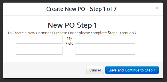
    The result of pushing the first button
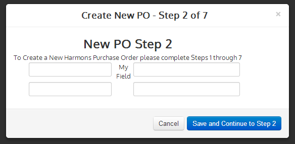
    The result of pushing the second button
    Here is the code for the modalWindow custom control. Note that this is a work in progress. I will try to make sense of this by footnoting parts that might be confusing.

    <?xml version="1.0" encoding="UTF-8"?> <xp:view xmlns:xp="http://www.ibm.com/xsp/core" xmlns:xe="http://www.ibm.com/xsp/coreex" xmlns:xc="http://www.ibm.com/xsp/custom"> <xp:text escape="true" id="computedField1"> 1)<xp:this.value><![CDATA[#{javascript:var idName = compositeData.id_name view.postScript("$('#default').attr('id', '" + idName + "');") }]]></xp:this.value></xp:text>
    2)<div id="default" class="modal hide fade" tabindex="-1" role="dialog" aria-labelledby="myModalLabel" aria-hidden="true"> <div class="modal-header"> <button type="button" class="close" aria-hidden="true"> × </button> <h3 id="myModalLabel"> 3)<xp:text escape="true" id="computedField3" value="#{javascript:compositeData.window_title}" /></h3> </div> <div class="modal-body"> 4)<xp:include id="include1">
    <xp:this.pageName><![CDATA[${javascript:compositeData.mainContent + ".xsp"}]]></xp:this.pageName> </xp:include> </div> <div class="modal-footer"> <button class="btn" aria-hidden="true"> Cancel </button> 5)<xp:button value="#{javascript:compositeData.button_title}" id="button1" loaded="true"> <xp:this.attrs> <xp:attr name="class" value="btn btn-primary" /> </xp:this.attrs> <xp:eventHandler event="onclick" submit="true" refreshMode="complete"> <xp:this.action /> </xp:eventHandler> </xp:button> </div> </div> </xp:view>

    1) This uses clientside javascript using JQuery to change the id from "default" to whatever was passed to the control in the button.
    2) Two things here: The id is set to "default", which is changed at runtime. This is also one of two places where data-dismiss="modal" was removed to fix the window from not closing properly. The other place is the cancel button.
    3) Reading the passed parameter to set the window title
    4) Reading the passed parameter to know what custom control to call for the main content. Thanks to Knut Herrmann for helping me out on Stack Overflow to get this working.
    5) Reading the passed parameter for the button title. This button was changed from an html button to an xpage button so I can write code for what to do upon submit.

    Monday, May 6, 2013

    Using Bootstap to Create a Responsive Application Design - Part 2

    In Part 2, I want to share the code that I used to create the navigation for my application.   The technique I am using with Bootstrap, is very analogous to using the extlib Application Layout Control.   You create your layout once in a custom control, and then add it to each xpage in your application.   You then add content in the facet area of your layout.  

    Presently, my layout is basically done, and I have shifted to creating the content of the application.   The application is fairly straightforward, so I was able to put the whole layout in two custom controls.   The screen shots in the previous post will show you what this looks like.

    The layout custom control shown here, contains the Bootstrap grid, and calls the header custom control.  I am using a grid of 1-10-1.


    <?xml version="1.0" encoding="UTF-8"?>
    <xp:view xmlns:xp="http://www.ibm.com/xsp/core" xmlns:xc="http://www.ibm.com/xsp/custom">

    <!-- Fix for IE8 -->
    <xp:text escape="false" id="computedField1"
    rendered="#{javascript:context.getUserAgent().isIE(0,8)}">
    <xp:this.value><![CDATA[#{javascript:"<style type='text/css'>body {padding-top: 45px; padding-bottom: 40px; }</style>"}]]></xp:this.value>
    </xp:text>

    <div class="container-fluid">
    <xc:header showCategories="true" />
    <div class="row-fluid">
    <div class="span1 visible-desktop">
    <xp:callback facetName="leftColumn" disableTheme="true" />
    </div>
    <div id="mainContent" class="span10">
    <xp:callback disableTheme="true" />
    </div>
    <div id="rightColumn" class="span1 hidden-phone">
    <xp:callback facetName="rightColumn" disableTheme="true" />
    </div>
    </div>
    </div>
    </xp:view>

    The header custom control is more complicated and contains different menu listings for a desktop and mobile device.   This CC contains all the menu navigation.  

     Here is a key to what each section does.  See the corresponding code in red.

    1. Uses Google Web font
    2. Creates Bootstrap Navbar fixed to the top
    3. Creates Mobile menu button that only shows when collapsed
    4. Creates the "Brand" which is the company name, I show different brands for different devices
    5. Creates dropdown capable menu
    6. Creates listing with dropdown values
    7. Create a caret to indicate dropdown choices
    8. Creates different listing of menu items for mobile devices, this way I can limit choices a mobile sees if I choose.

    <?xml version="1.0" encoding="UTF-8"?>
    <xp:view xmlns:xp="http://www.ibm.com/xsp/core" xmlns:xc="http://www.ibm.com/xsp/custom">

    1.)<link href='http://fonts.googleapis.com/css?family=Oxygen' rel='stylesheet'
    type='text/css' />
    2)<div class="navbar navbar-fixed-top">
    <div class="navbar-inner">
    <div class="container-fluid">
    3)<a class="btn btn-navbar" data-toggle="collapse" data-target=".nav-collapse">
    <span class="icon-bar" />
    <span class="icon-bar" />
    <span class="icon-bar" />
    </a>
    4)<a class="brand" href="/po/po.nsf">
    <span class="hidden-phone float-left">
    <xp:image url="/harmons_reverse.png" id="image1" />
    <span id="brand-label-big">
    <xp:label value="&#160;&#160;Purchase Orders" id="label1" />
    </span>
    </span>
    <span class="visible-phone" id="phone-text">
    <xp:image url="/harmons_reverse_phone.png" id="image2" />
    &#160;&#160;Purchase Orders
    </span>
    </a>
    5)<div class="visible-desktop dropdown">
    <ul class="nav nav-pills">
    <li class="${javascript:view.pageName == '/follow.xsp' ? 'active' : ''}">
    6)<a class="dropdown-toggle" data-toggle="dropdown" href="#">
    View PO's
    7)<b class="caret" /></a>

    <ul class="dropdown-menu" role="menu" aria-labelledby="dLabel">
    <xp:link text="Active PO's"  value="/Active_PO.xsp" />
    <xp:link text="Pending PO's" 
    value="/Pending_PO.xsp" />
    <xp:link text="Completed PO's" 
    value="/Completed_PO.xsp" />
    <li class="divider" />
    <xp:link text="All PO's" value="/All_PO.xsp" />
    </ul>
    </li>
    <li class="${javascript:view.pageName == '/about.xsp' ? 'active' : ''}">
    <xp:link text="Manage Vendor Info" />
    </li>
    <li
    class="${javascript:view.pageName == '/contact.xsp' ? 'active' : ''}">
    <xp:link text="Create New PO" 
    value="/New_PO.xsp" />
    </li>
    </ul>

    8)<div class="collapse nav-collapse hidden-desktop dropdown">
    <ul class="nav nav-list">
    <li>
    <xp:link text="Create New PO" 
    value="/New_PO.xsp" />
    </li>
    <li>
    <xp:link text="Active PO's" value="/Active_PO.xsp" />
    </li>
    <li>
    <xp:link text="Pending PO's"  value="/Pending_PO.xsp" />
    </li>
    <li>
    <xp:link text="Completed PO's" 
    value="/Completed_PO.xsp" />
    </li>
    <li>
    <xp:link text="All PO's" value="/All_PO.xsp" />
    </li>
    <li>
    <xp:link text="Manage Vendor Info" />
    </li>
    </ul>
    </div>
    </div>
    </div>
    </div>
    </xp:view>

    Monday, April 29, 2013

    Using Bootstap to Create a Responsive Application Design - Part 1

    My new project involves creating an entirely new Purchase Order database to replace a "traditional" domino application.    We decided to sunset the our old PO database, and start from scratch using xpages and a modern look and feel.   This application will be customer facing, so unlike an internal app, I don't know what user agent the customer will be using.

    To make the app friendly to any type of device, I decided to create a responsive design using Bootstrap.   I will create a series of post based on my experience (or lack thereof) using this method.

    To start, I decided to use Collaboration Today as a model.   The design is out on openntf for all to use.   Prior to starting this project, I learned as much as I could on Bootstrap and managed Java beans since I will be using both on this project.

    Getting started was selectively copying elements from CT.nsf into my design, and removing elements I don't need.   This is the first app that I used a theme, and I finally see the benefits of using them.   Another strange thing that happened is that I found myself (so far) exclusively using the Source pane.  When integrating outside frameworks, the design pane is virtually useless.

    My design has far less content that CT, so I so far am using just two custom controls for the layout.   One called "layout" which contains the grid, and one called "header" which contains the menu bar.   All of my xpages will call these two custom controls.

    This is all subject to change, but this is how it looks so far.
    This is the design when viewed in a normal desktop and a tablet in the horizontal position.
    This is the very same design when view on a tablet vertically.  Notice button bar instead of dropdown menu.
    Again, the very same design in a mobile device.   Note:  I load a smaller logo for mobile, but otherwise the same a vertical tablet.
    Effect of touching menu button.  The main content slides down gracefully.
    Notes:

    • I am using Google Web Fonts.   I haven't used them before, but now I am a big fan.  I might do a separate post on how easy they are to use.
    • In my CSS, I make extensive use of media queries, to setting padding, borders, etc. 
    • My main grid at this point is a 1-10-1 layout.   This is subject to change.
    • I am really just beginning here, and will document more coding methods as I get further into this project.